Over the past several years we have been intrigued by the growing frequency of colorful circular diagrams with interior spanning ribbons. These infographics have been featured on magazine covers and within articles, most often in the realm of genomics. Our curiosity about these circular ideograms led us to a free software tool developed by Martin Krzywinski named Circos.
As data sets explode in size, often the means to effectively visualize insights becomes more challenging. Sometimes the insights are buried within the small irregularities and not in a macro perspective. We subscribe to Edward Tufte’s advise to keep data ink efficient, i.e., present the idea with the data in a fashion which is honest and minimizes decoration. It was just such a big data quandary that shaped Krzywinski’s solution. Originally, Circos was designed to “facilitate the identification and analysis of similarities and differences arising from comparisons of genomes”. After reading his paper in Genome Research, one more fully appreciates the depth of granularity achievable with this tool. Not merely beautiful illustrations, one can use the software to scale relationships and flexibly rearrange elements to create a diverse range of visualizations from different data domains. In big data, small features might get lost, however, Circos allows one to resize small features to make them discernible.
If you are interested in trying this tool out yourself one need only visit this link. For limited scaled tabular data one need not even download the software, simply upload a suitably formatted file and a diagram can be generated for you.
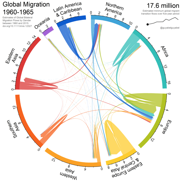
As you might imagine, the circular ideogram is not exclusively for genomic data and indeed there is other software which can create circular ideograms (e.g. “R”, a language and environment for statistical computing and graphics). One example we found compelling was by Guy Abel who has created an animated version illustrating worldwide human migration between and within defined regions between 1960 and 2015 based on United Nations data. Scale and color are effectively used to illustrate the fluctuating scale of migrations over this 55 year period in a roughly 10 second gif.
Krzywinski, M. et al. Circos: an Information Aesthetic for Comparative Genomics.
Genome Res (2009) 19:1639-1645